
This project is something I have been excited to share with all of you for several months. I waited to blog it until I had lived with the final result for awhile and made sure it wasn’t going to unravel two days after I finished it. Fortunately, it didn’t unravel, it still looks great, and we still love how it turned out. The project I’m talking about is this:
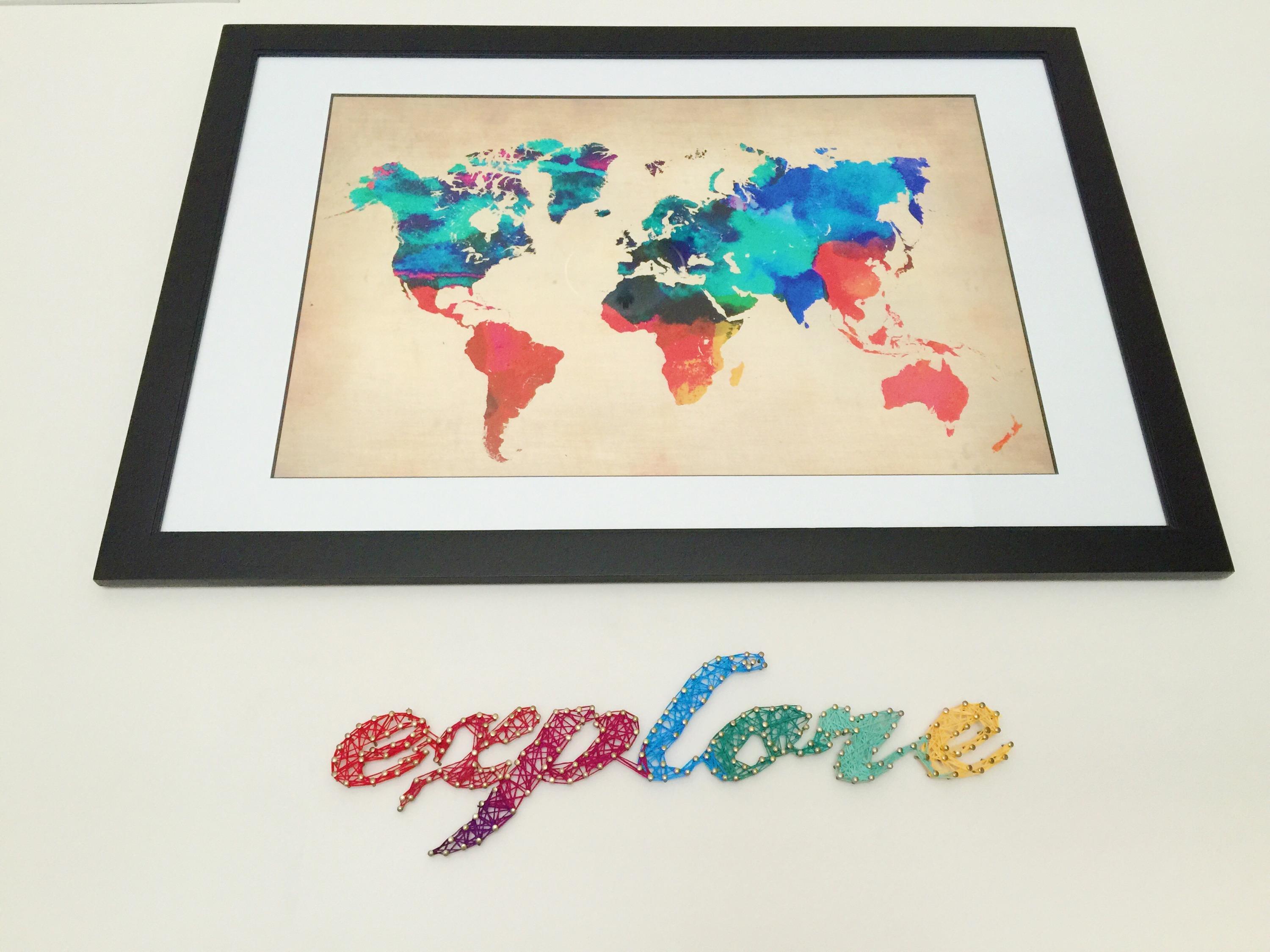
We really like how it turned out and it gave the wall at the top of our stairs some much needed color. We’ve lived in this house for a few years now, and hadn’t really settled on anything permanent for that wall. It was just a big block of anti-climactic blah as soon as you get to the top. We’ve tried a dresser that only lasted until two of us nearly broke a foot on the corner. A bench that no one sat on and a very lonely chair that just looked sad didn’t make the cut either. We finally realized that because there is a door to a bedroom right there, maybe seating and storage wasn’t the best option. So we started looking at large artwork because we love large artwork and we wanted something to take up quite a bit of real estate on the wall. Because we like travel and try to collect meaningful things from places we go, we chose a colorful world map, and had it framed at Michael’s when they had a framing sale. We had to get it professionally matted and framed because it was not a standard size, but depending on the artwork you choose, you may be able to use a standard size frame from a craft store.
Next, I chose several colors of embroidery floss, selecting colors from the artwork. I bought two skeins of each color, and had TONS left over for another project.
I also picked up some linoleum nails at the hardware store, and grabbed a pencil, hammer and a level from the toolbox. Time to get to work.
We started by measuring and hanging the framed art centered on the wall, but slightly higher usual, since there was going to be a word underneath the picture, and we wanted the entire piece to look centered. Using a pencil and a level to mark where we wanted it made it quick work, so we could get on to the fun part. I printed out the word ‘EXPLORE’ using Photoshop and my everyday printer, but this can also be done with Word. We chose the font size based on the artwork size, but play around with the size that works best for your piece. I do recommend starting around 200pt, and adjusting from there. We taped the paper to the wall using the level again to position it correctly. Now it’s time to nail.
This part isn’t hard, but it can be a little tricky, so I’m going to tell you the mistakes I made so you won’t have to. First, hammer the nails into the wall, through the paper and outline your word or phrase. You want to space the nails far enough apart so they don’t crowd each other, but not so far that your letters lose their shape. Try to keep the nails as perpendicular to the wall as possible, but if a few aren’t perfect, it’s fine. Tap lightly to drive the nails into the wall, but don’t let them go all the way into the wall: you want the finished word to look dimensional. You’ll have something like this:

Now this is where I made my first mistake…I excitedly ripped the paper from around the nails, only to be completely confused about where to string some parts of the letters. I had used a stylized font which connected the letters, but made it nearly impossible to tell where some of them were going. I spent a lot of time referring to a photo of the word trying to figure out where to begin. It would have been much easier if I had torn the paper off each letter right before I began to string it, so I could easily see where to go next. Now it’s time to string the letters.
This is the longest part of the project, but it isn’t hard. From start to finish, it only took about an hour, and I listened to a movie in the background which made the time pass quickly. Start by tying the embroidery thread around the head of the nail. String the outline of each letter first, then fill in with thread.

I began filling in first and it made the letters look undefined and unfinished. However, once the letters are outlined, the more haphazard they are filled in the better they look. See how the string goes between the nails in all directions? That’s a good thing.

Just run the string back and forth until they look solid, and begin the next letter. We chose to overlap the colors a bit to blend them into each other. To finish each letter, just tie a small knot like you’re tying a shoe, and tighten it around a nail head. Cut off any excess string and you’re done.
Get creative here! Blend color between letters or use several colors on the same letter. You could mix up your fonts and use several in the same word, and use every color on every letter. Maybe you want a monochromatic look, so you could use several shades of the same color. The possibilities are really endless, and if you’re renting, fear not! This can be done on a sheet of plywood and framed for moveable art (and fewer looks of disdain and lost security deposits). Make this project suit your taste, budget and living situation.
I really had fun with this project and I hope you will too! If you try it, let me know how it turns out, or better yet, take pictures and share them with me! Tag #eclecticyellowhouse on Instagram, visit my Eclectic Yellow House Facebook page, or share via e-mail…I’d love to see where you guys take this! Until then, happy stringing!

Kathrina, I wondered when you would have time to post this project. I have admired it ever since I first saw it. Its impact is amazing. My mouth dropped on first seeing it! With directions in hand, I can’t wait to begin my first string project.
Thank you! I can’t wait to see what you create with string!
How creative of you! I am impressed!
So kind! Thanks!